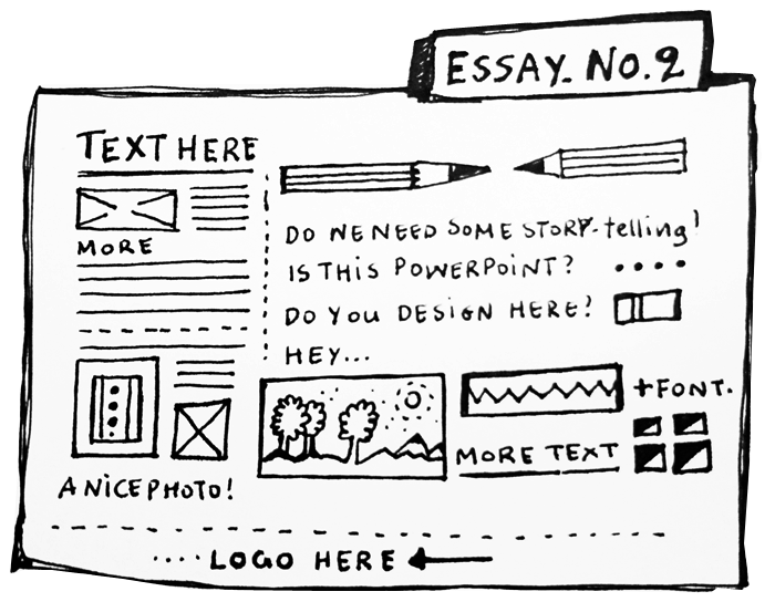
When I first opened a powerpoint file I was sitting in front of the screen for few minutes trying to decide where to go. I remembered all the super-busy powerpoint presentations I had seen in my life, with ready-made backgrounds, “supposed to be cool” effects, bad typefaces, low quality pictures and no information hierarchy at all. Is it difficult to design in Powerpoint? I thought, why is it any different from designing a book with an information flow, a good structure per page, a hierarchy on text among the 40 pages or more. Few months later, I became the “Presentation designer” and I was also doing the final refinements on presentations before they leave the company. I really enjoyed working on the “Story” of each presentation.
No matter how “expected and boring” it is supposed to be if it has to include only numbers and data, I feel there is always a good way to make infromation pleasant. Specific typeface (among the ones we can select), high quality images based on the same aesthetics, grouped graphics and colored-tables and above all, simple and neat. One meaning per slide. Tom Klinkowstein my professor and Thesis consultant back in Pratt, was the one to explain me how to do a good powerpoint presentation. Few words per slide and a clear nararrative keeps the listener or message receiver interested. Everybody wants things to get interesting, so the best test is to show it to somebody without even saying something. From my experience, everybody likes beautiful images, messages, stories and a happy closure.
So everytime a Powerpoing mission appears, I keep in mind:
- A good narrative (make the message clear and the story as short as possible)
- Logos and stable elements across the presentation in order to keep it branded. I want to know that in the first and 89th slide I am still in the same presentation.
- High quality images (We live in the HD era)
- Typography consistency & Hierarchy (if the subtitles are grey and 20 points they should be that way everywhere, it keeps me concetrated and helps me code and understand the information faster)
- Few words per slides (It’s better to have more slides with a clear message in each one, the rest can be explained verbally)
Don’t forget, your thoughts are always welcome.